THE CLIENT:
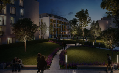
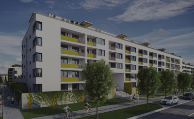
Since 1992, Cresco Group has become a prominent Slovak developer of residential and commercial development projects. One of the current projects is, brand new district at the edge of Bratislava, Petržalka.
What more, client is strongly focused on quality, design and innovation – just like we are. Hence the ideal conditions for us to create a truly remarkable piece of work.
THE CHALLENGE:
Within the context of Bratislava, Slnecnice are indeed an exceptional project. However, there were several challenges we needed to address.
One of the major challenges was the locality itself. The proximity of forests is very attractive – but at the same time it aroused a lot of questions with potential buyers, who were afraid that Slnecnice are too far from the city centre and from the public facilities.
Second considerable challenge was to find a way how to distinguish Slnecnice in a very competitive market and clearly position it as a clear choice for potential customers.
THE DELIVERY:
New web for Slnecnice had to reflect the project itself – it had to be innovative and different. We also deliberately built the website to fulfill 2 objectives: create a memorable experience from visiting the website on one hand and continuously address and remove possible objections and barriers.
One of the major components of this experience is the homepage. Right after visiting the website we showcase, in an interactive and attractive way, how close and rich are in fact the public facilities. This also serves to remove some of those barriers right off the bat and help us to put Slnecnice in a great light.
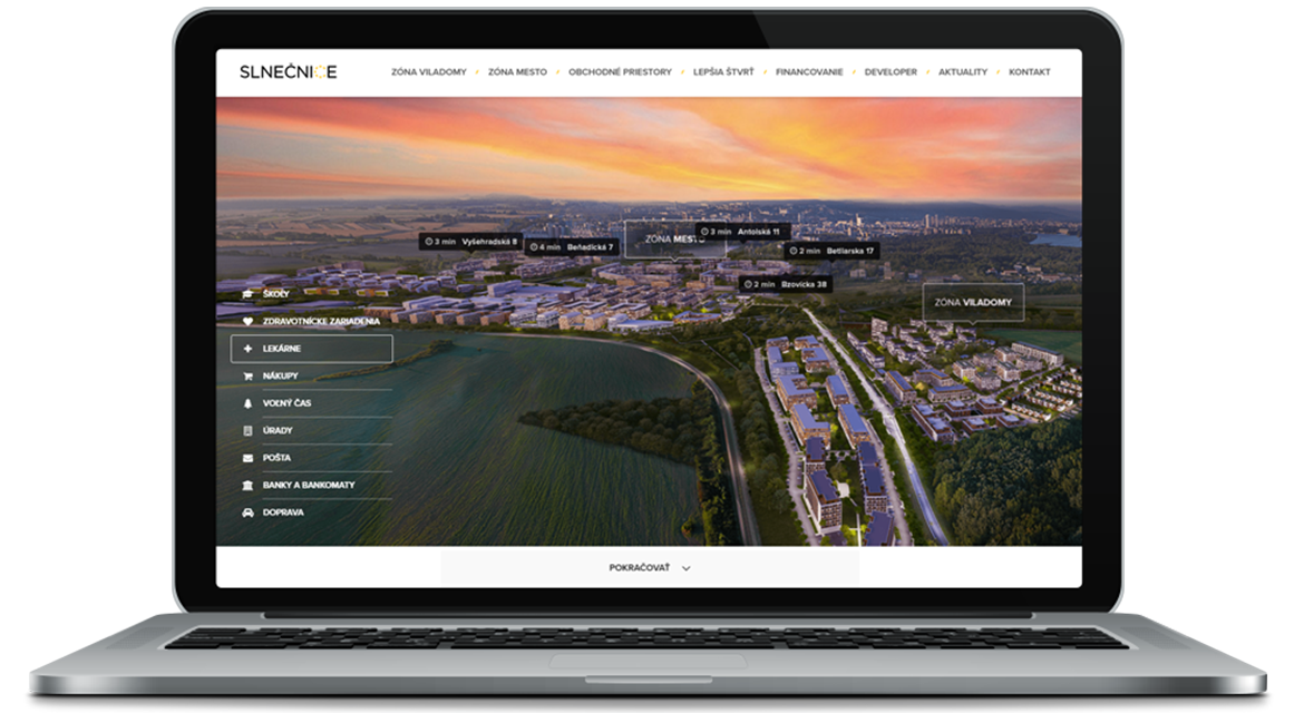
This further enables us to draw visitors deeper and communicate all the arguments for Slnecnice. And since these arguments are quite numerous, we have put a great deal of effort to organize them all clearly and logically. Our effort was strengthened by strategically positioned options enabling visitors to arrange an inspection right that moment, without losing their precious attention or forcing them to search for some ill-positioned contact form.
This resulted in a valuable outcome – interest and leads.
And what of this means for the potential buyers?
The decision to buy an apartment is one of the major life moments. Knowing this, we have designed all the parts of our website in a way that enables people to find, smoothly and intuitively, everything necessary to answer their questions and dispel their doubts:
From a sophisticated 3D navigation through apartment comparison tool up to reserving inspections of several apartments via single click – all of this helps customers to make their big decision.
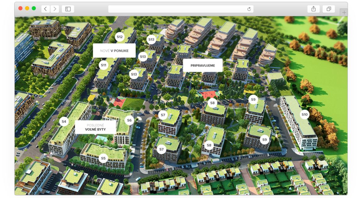
Thanks to an interactive kiosk we have also brought all of these functions to a sale point, creating yet one more space where people can experience Slnecnice.
And the result?
Apart from delivering a stunning website, our approach also helped to establish a future communication of the whole project. We have united all the extra functions and solutions on the website under a single goal – lead visitors to a decision and conviction that Slnecnice is the place they want to live in. And the number of sold appartments proves our point.

